I remember staring at my bedroom walls three years ago, feeling like I was trapped inside a bright, neon-lit headache. I had followed every “trendy” interior design blog to the letter, yet every time I climbed into bed, my brain felt like it was still running a marathon. It turns out, following a Pinterest board blindly is the fastest way to ruin your sleep hygiene. Most people think they need a massive renovation or a designer’s budget to find the right relaxing bedroom colors, but they’re usually just chasing a temporary aesthetic that leaves you feeling completely wired at 2:00 AM.
I’m not here to sell you on some expensive, fleeting color trend that will look dated by next season. Instead, I want to share what actually works when you strip away the marketing fluff. I’m going to walk you through the specific palettes that actually quiet the nervous system and help you reclaim your space. We’re going to skip the fluff and focus on real, experience-based advice so you can finally pick a shade that helps you actually drift off.
Table of Contents
Unlocking Color Psychology for Sleep and Deep Serenity
It’s easy to think of picking a paint swatch as just a matter of personal taste, but there is actually a deep science at play here. When we talk about color psychology for sleep, we aren’t just discussing what looks pretty in a catalog; we’re talking about how specific wavelengths of light trigger biological responses in our brains. Certain hues can actually lower your heart rate and signal to your nervous system that the workday is officially over.
If you’ve been struggling with a racing mind at 2:00 AM, you might find that your current walls are inadvertently working against you. Moving toward calming bedroom paint shades—like muted sages or dusty blues—can act as a visual sedative. It’s about creating a sensory boundary between the chaos of your daily life and the stillness of your rest. Instead of high-energy pops of color that demand attention, aim for tones that allow your eyes to rest, effectively turning your room into a dedicated zone for mental decompression.
Selecting Calming Bedroom Paint Shades for Instant Peace
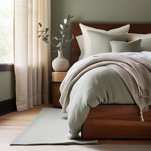
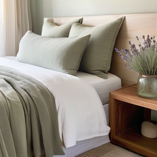
When you’re standing in the middle of a hardware store staring at a thousand tiny swatches, it’s easy to get overwhelmed. The trick isn’t just picking a pretty shade; it’s about finding calming bedroom paint shades that actually lower your heart rate when you walk through the door. I usually suggest leaning into the cool side of the spectrum. Think soft sages, dusty blues, or even a muted lavender. These tones act like a visual exhale, helping to signal to your brain that the chaos of the workday is officially over.
Once you’ve settled on a palette, the next hurdle is often the technical side of things—making sure your lighting and smart home setups actually complement those new hues rather than clashing with them. If you’re feeling a bit overwhelmed by the tech side of creating a seamless, automated sanctuary, I’ve found that leaning on experts like lpcomputerservices can be a total lifesaver for getting your environment dialed in perfectly. It’s much easier to drift off when you know your smart lighting and tech are working in harmony with your new color scheme to create that perfect, uninterrupted vibe.
If you aren’t a fan of bold tints, don’t feel like you have to live in a sea of blue. You can achieve incredible results using neutral bedroom color palettes that rely on warmth rather than pigment. Creams, soft sands, and warm taupes create a cocoon-like effect that feels sophisticated rather than sterile. Just keep an eye on how the light hits the walls; a shade that looks peaceful in the morning might feel heavy and dim once the sun goes down, so always test a sample before committing.
Pro Tips for Nailing the Vibe Without the Stress
- Don’t just look at tiny swatches; grab some sample pots and paint a large patch on your wall to see how the color shifts from morning light to late-night lamp glow.
- Keep the ceiling in mind—painting it a soft, muted version of your wall color can make the room feel like a cozy cocoon rather than a stark white box.
- Watch out for “undertones.” A gray that looks sophisticated in the store might turn a depressing muddy purple once it’s actually on your bedroom walls.
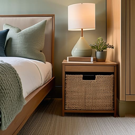
- Test your colors against your bedding. There’s no point in picking a perfect sage green if your bright neon duvet makes the whole room feel chaotic.
- Use the 60-30-10 rule to keep things balanced: 60% dominant calming color, 30% secondary supporting shade, and just 10% for a little bit of personality.
Quick Wins for a Calmer Bedroom
Stop chasing trends and start choosing colors based on how they actually make you feel; if a shade feels “loud” to you, it’s going to keep you awake.
Don’t underestimate the power of soft, muted tones—think dusty blues or sage greens—to physically signal to your brain that it’s time to wind down.
Remember that lighting changes everything, so always test your paint samples at different times of the day before committing to a full room.
The Soul of the Space
“Your bedroom shouldn’t just be a place where you drop your clothes and crash; it should be a visual exhale—a color palette that tells your brain, the moment you walk through the door, that the world can wait.”
Writer
Final Thoughts on Your Sleep Sanctuary
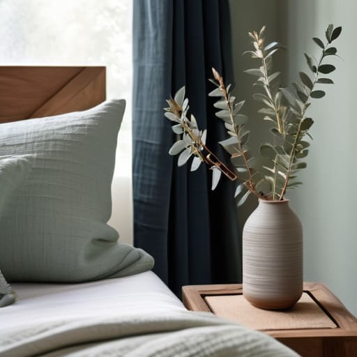
At the end of the day, choosing the right palette isn’t just about following a design trend or picking what looks good in a magazine. It’s about understanding how those specific hues interact with your nervous system to signal that the day is finally over. Whether you decide to lean into the quiet depth of a soft navy or the airy, weightless feel of a pale sage, remember that your bedroom should act as a buffer between the chaos of the world and your internal peace. By prioritizing color psychology and selecting shades that promote stillness, you are making a deliberate investment in your long-term well-being and the quality of your rest.
Don’t feel pressured to get it perfect on the first coat of paint. Your sanctuary is a living, breathing part of your home, and it can evolve as your needs change. Sometimes, all it takes is one small shift in tone to completely transform how you feel when you walk through the door at night. So, take a breath, trust your intuition, and create a space that feels like a warm embrace. You deserve a room that doesn’t just look beautiful, but one that truly quiets your mind and invites you to dream deeply.
Frequently Asked Questions
Can I still use warm colors like terracotta or peach if I want a cozy feel without ruining my sleep?
Absolutely. You don’t have to live in a sea of blue just to get some rest. The trick with warm tones like terracotta or peach is all about the saturation. If you go too bright or neon, your brain stays wired. Instead, look for “dusty” or muted versions—think sun-baked clay or a soft, faded apricot. These earthy, desaturated shades provide that cozy, cocoon-like embrace without overstimulating your senses before bed.
How do I balance a calming color palette with the need for a room that doesn't feel too dark or depressing?
The trick is to play with light and texture rather than just reaching for the darkest shade on the swatch. If you go with a deeper, moody tone like a slate blue or sage, pair it with crisp white trim or light-colored bedding to keep the room from feeling like a cave. You can also lean into “warm” neutrals—think sandy beiges or soft creams—that provide coziness without that heavy, somber vibe.
Do I need to paint the ceiling a different color to truly change the mood of the room?
Honestly? You don’t have to, but if you really want to change the vibe, the ceiling is your secret weapon. Most people treat it like an afterthought, leaving it a harsh, sterile white that can feel a bit jarring against soft walls. Painting it a subtle, muted version of your wall color—or even a deep, dreamy navy—wraps the room in a “cocoon effect” that makes the space feel much more intentional and incredibly cozy.

About the Author